Gabby Preston
Graphic Designer
Gallery
View the making of Gabby Graphics, my branding of myself that reflects me, my interests, and character. Here you will find my design process while making Gabby Graphics, my logo, and my business card.
BeeUtiful Hair Care is a personal project that allowed me to have creative freedom. I idealized a bee-themed hair care brand for curly and coily hair that focuses on 100% natural products and sustainable packaging. Here you will find my ideation of BeeUtiful Hair care, a logo, business card, and poster.
View my projects that are designed to be a form of a booklet. Here you will find a letter form booklet I created, a font that goes with the booklet, and a redesign of Food & Travel Magezine.
View my UX/UI which include collaborative projects with fellow designers! This includes a concept of a gps app and a concept of an informative we that teaches kids about the solar system (Plan.Net).
Gabby Graphics
Ideation


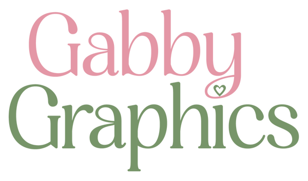
Gabby Graphics Logo/Mini Logo


The final product of the Gabby Graphics logo! This logo reflects my girly nature but with a touch of my more professional graphic design side. The logo is pink and green as they are my favorite colors!
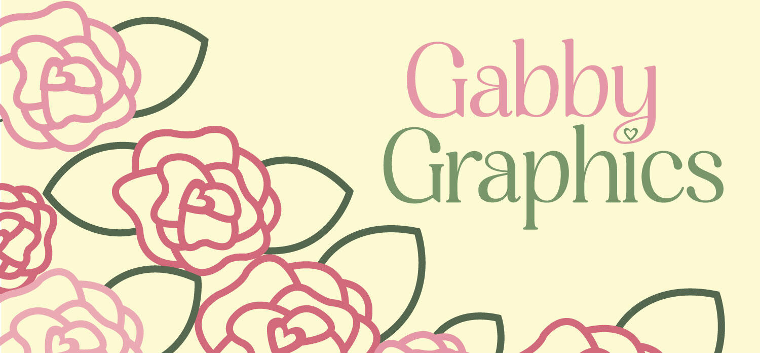
Gabby Graphics Business Card


Gabby Graphics business card is heavily inspired by the mood board I created. It is also the main inspiration for my website!
BeeUtiful Hair Care
Logo Variations


BeeUtiful Hair Care Logo

The final product of the BeeUtiful Hair Care logo! I picked this logo because it felt the most balanced while keeping the whimsey of this brand.
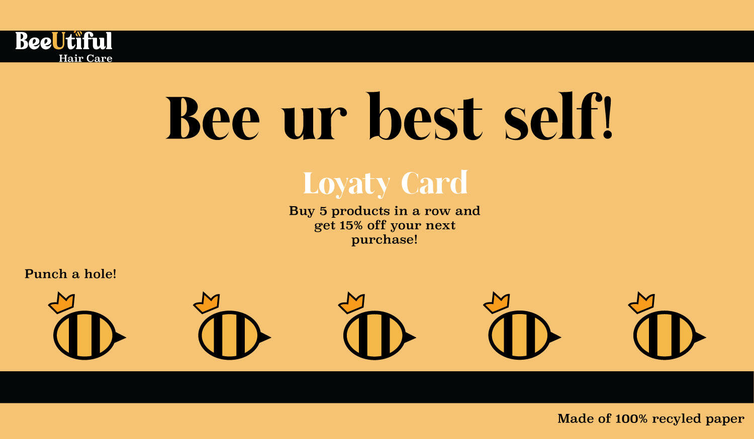
BeeUtiful Hair Care Business Card


The BeeUtiful Hair Care business card was created to also be used as a loyalty card for customers. It was also created with the idea that it would be placed on beehive shaped business cards.
BeeUtiful Hair Care Poster

The BeeUtiful Hair Care Poster was more focused on marketing the products (for curly/coily hair) and their brand promises (100% natural sustainable products).
Booklet Projects
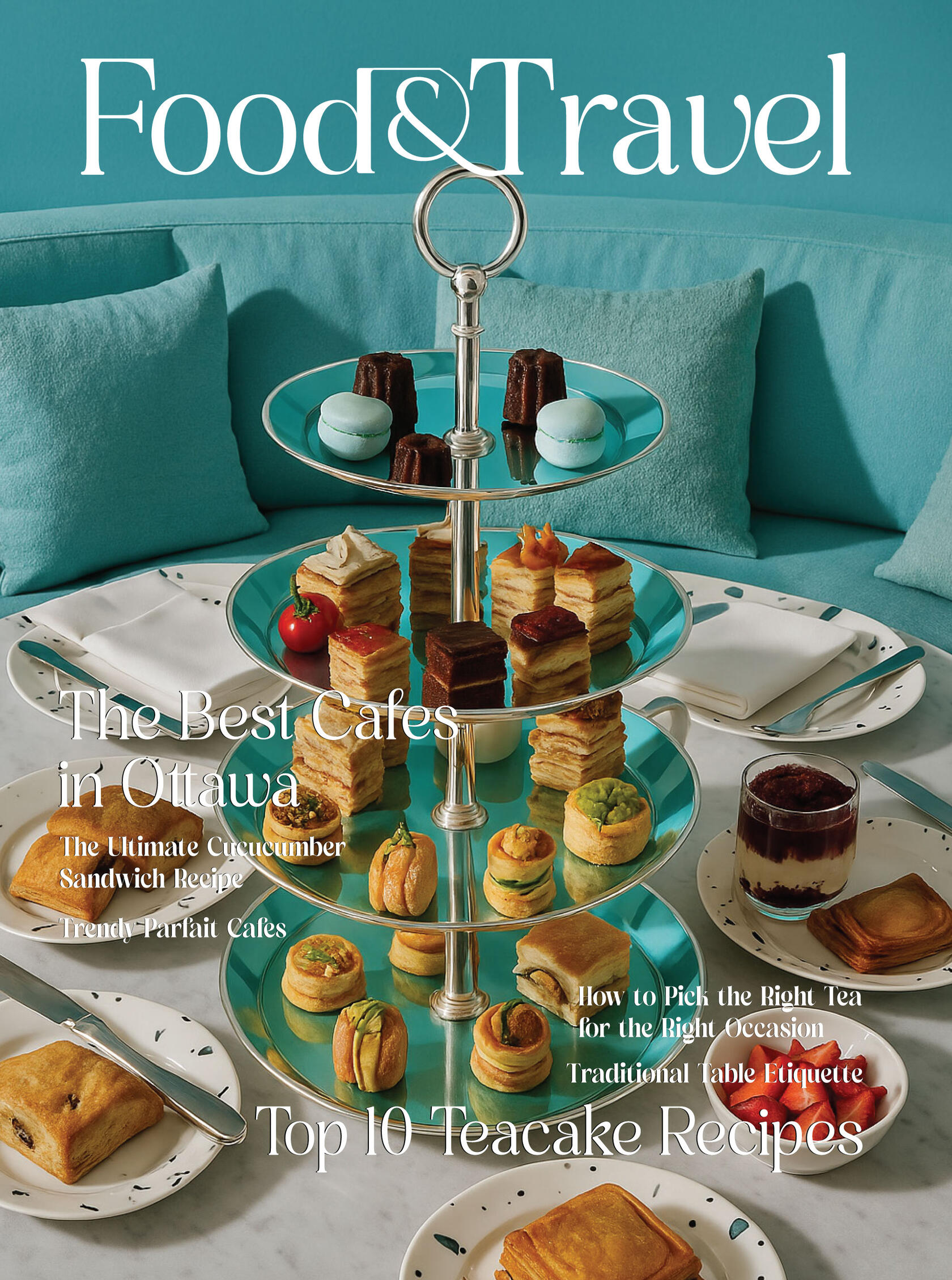
Food & Travel Magazine


This is a redesign project of the existing Food & Travel magazine. All design choices, including the masthead, were created by myself but the content inside is not mine (besides a couple easter eggs!).
Gilbert Letterform Booklet


The Gilbert letterform booklet which folds in four (which is why there are empty spaces). It contains a font I created myself along with facts about the alphabet. Being that it is a booklet that folds, it is meant to be read right to left.
Gilbert

Gilbert is a font I created. It is named after my father who, while I was creating this font, joked that I was just learning my ABC's while in college.
UX/UI
Road to Go
Road to Go was a collaborative UX/UI project with my entire class of fellow designers! I was tasked with the gas station stops aspect of the app. I worked with classmates to create the final product (ideation, color palettes, icons, etc) but I created the gas station stops animations and icons by myself.
Plan.Net
Plan.Net is an ideation of a website that educates kids about the solar system while making it entertaining. Unlike other UX/UI projects, this was done by myself.
About Me
Gabby Preston
My name is Gabrielle Preston (I go by Gabby) and I am a graphic design student at the University of Alabama in Huntsville. I am set to graduate Spring 2026. Art is not just a passion of mine, it is my lifestyle. Whether it be graphic design, clothing, nail art, or drawing, I have always found a way to express myself. I enjoy graphic design greatly because of the process a designer has to go through to create the final product. I enjoy collaborative projects as it helps me learn and grow as a designer. If you wish to learn more about me professionally, please view my resume and/or contact me!